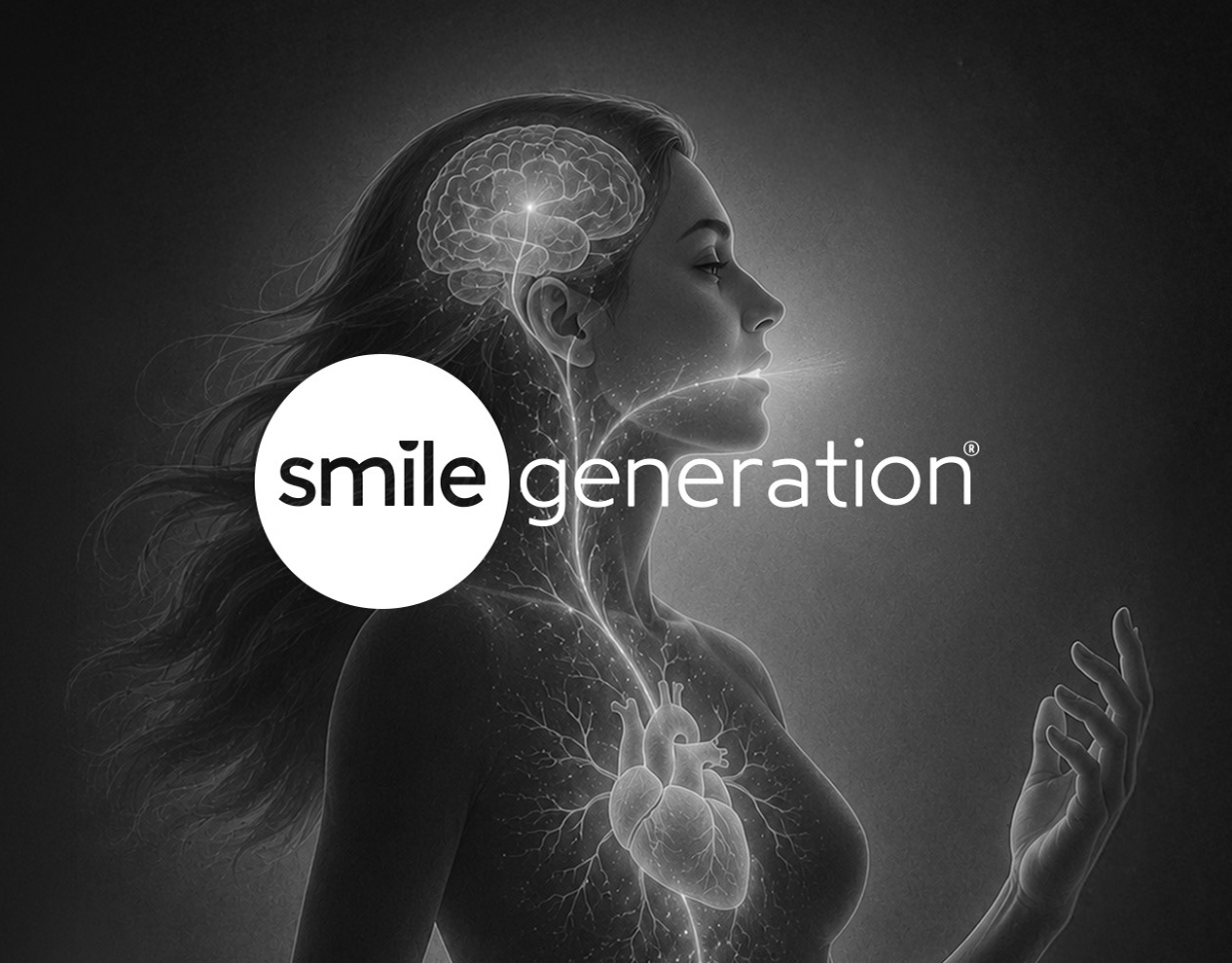
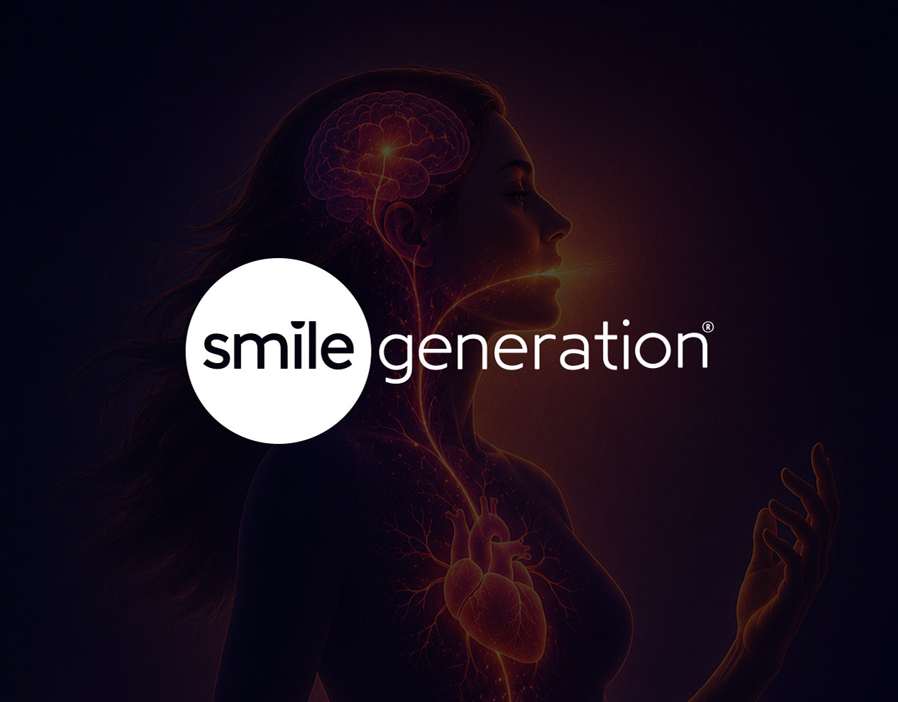
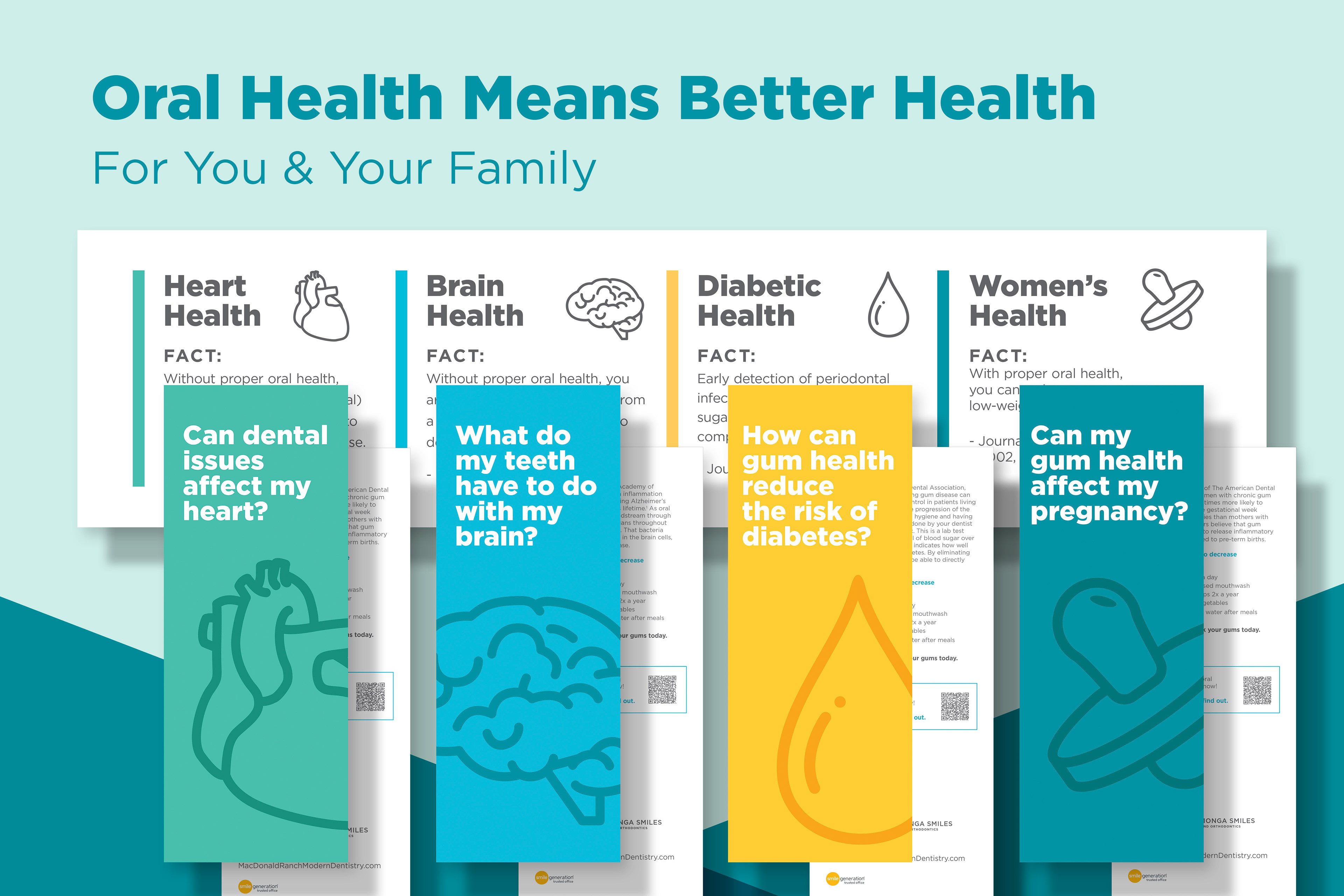
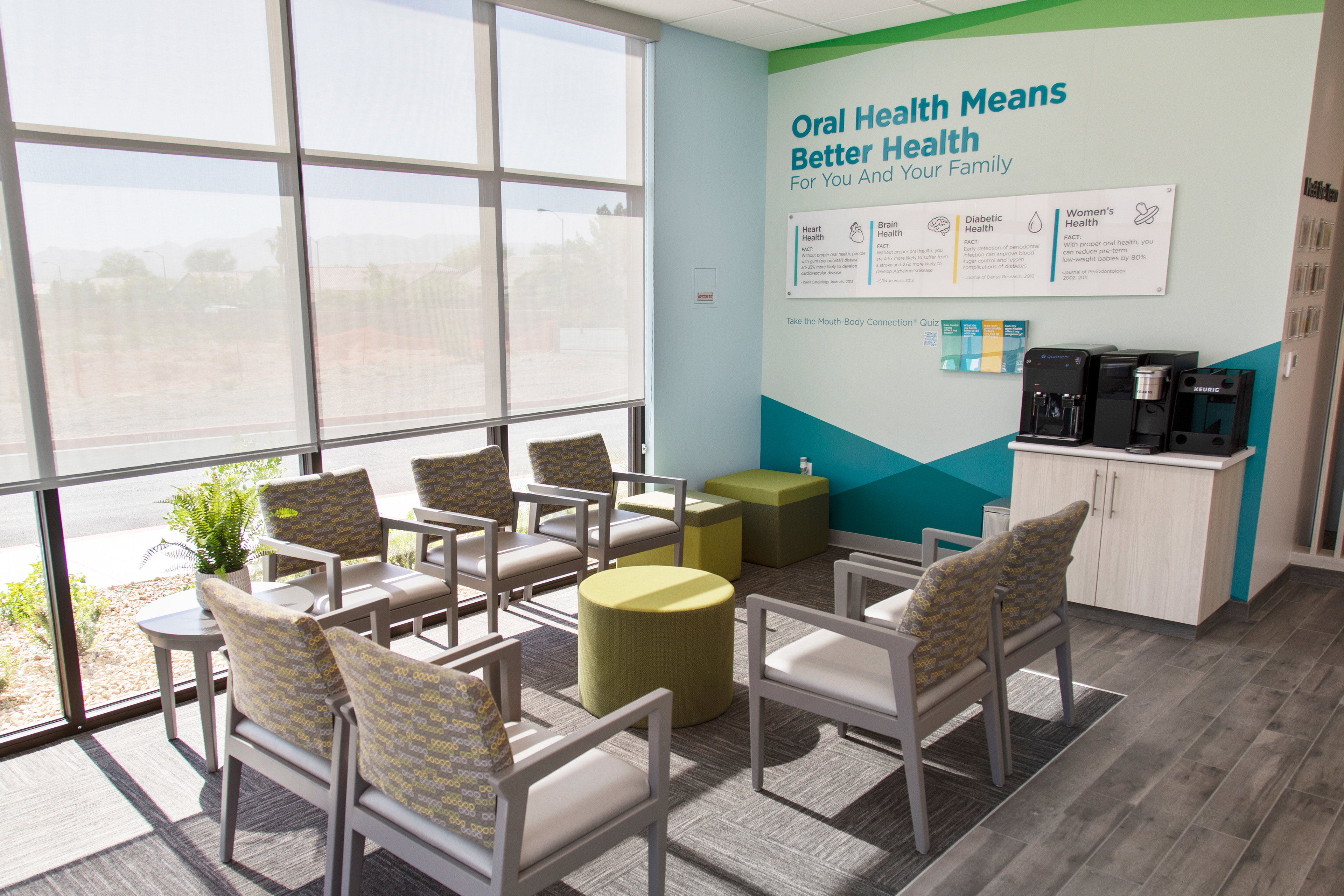
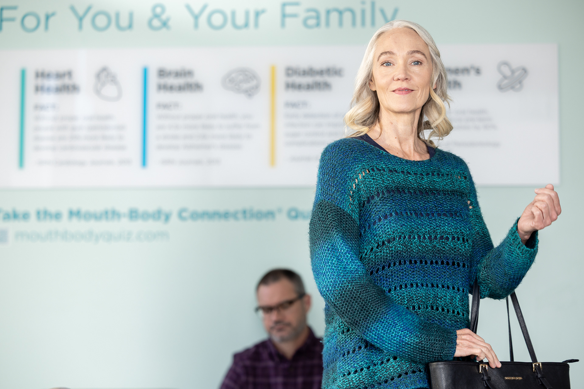
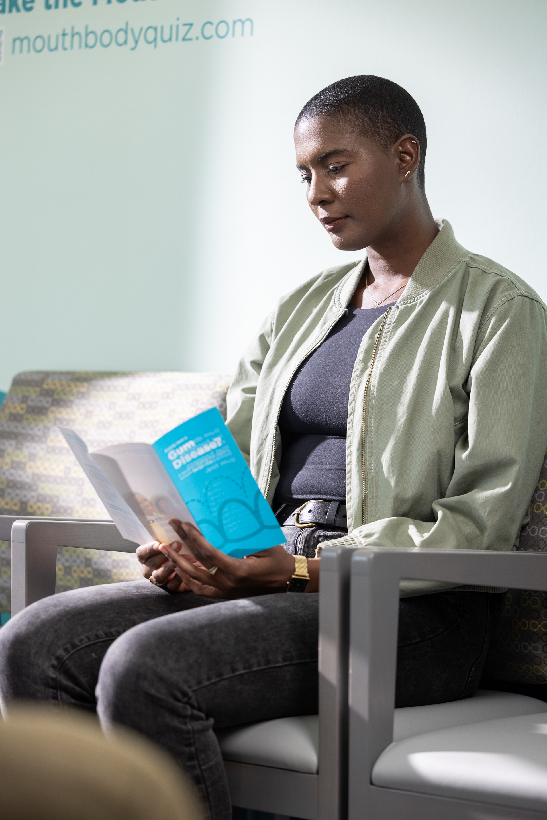
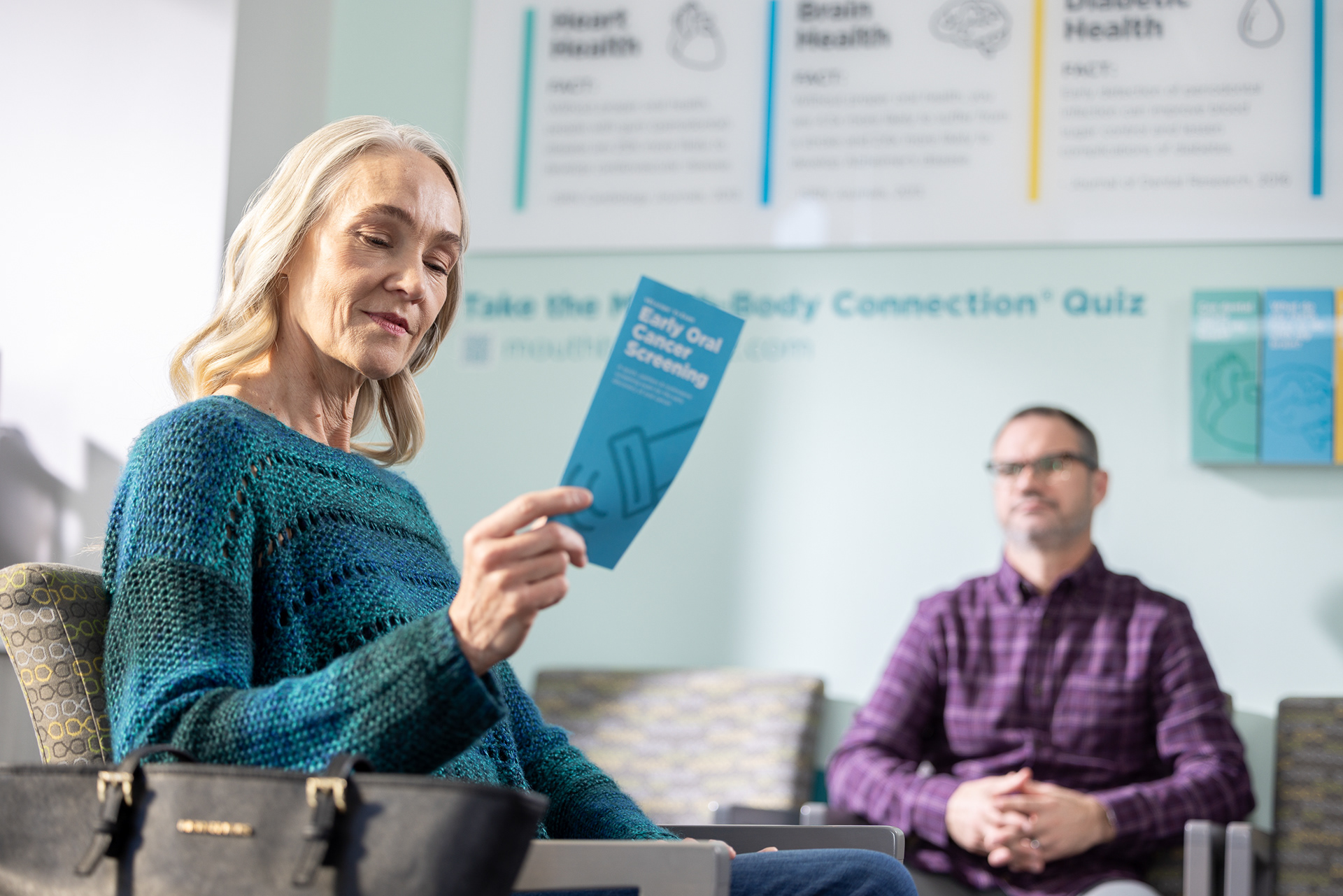
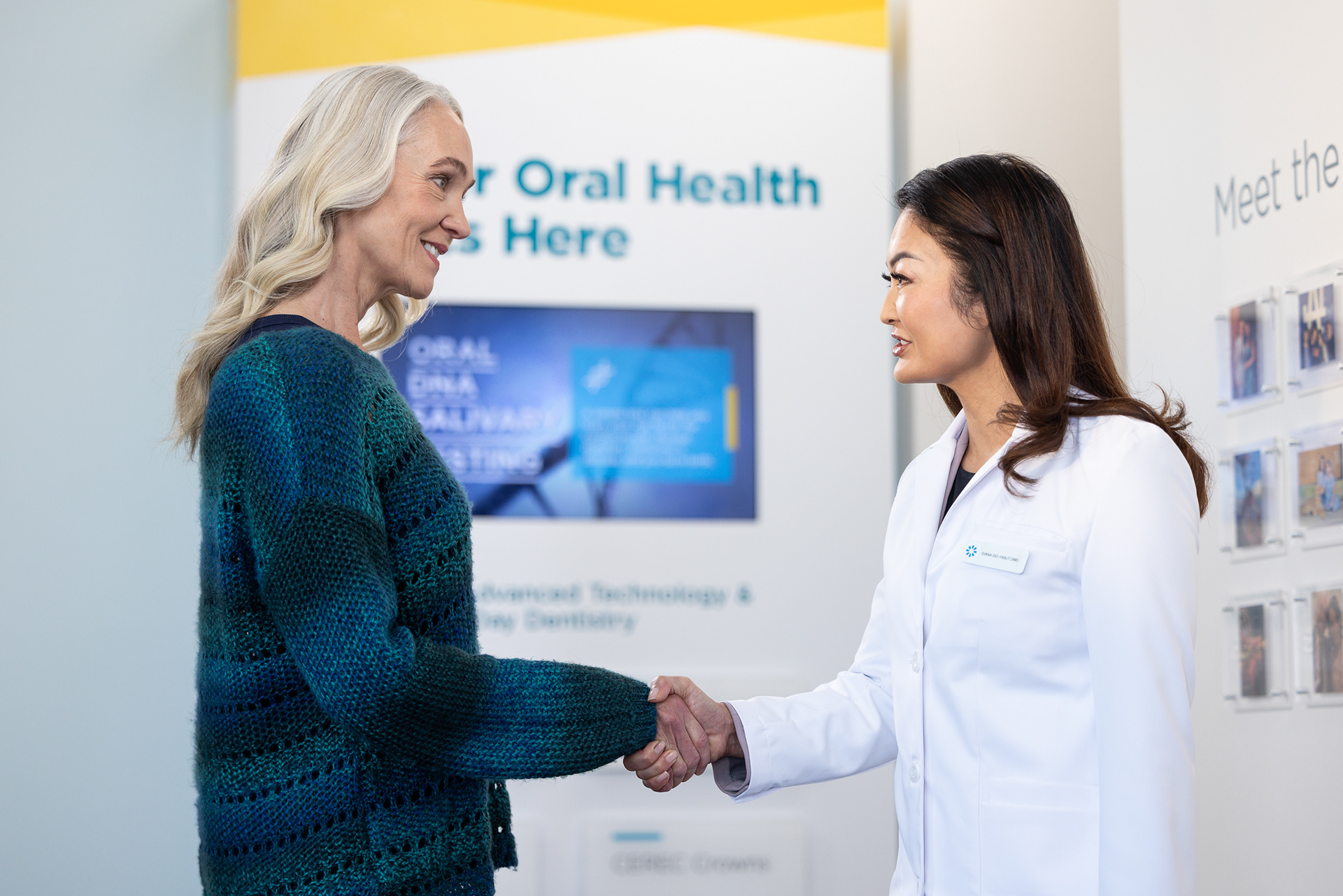
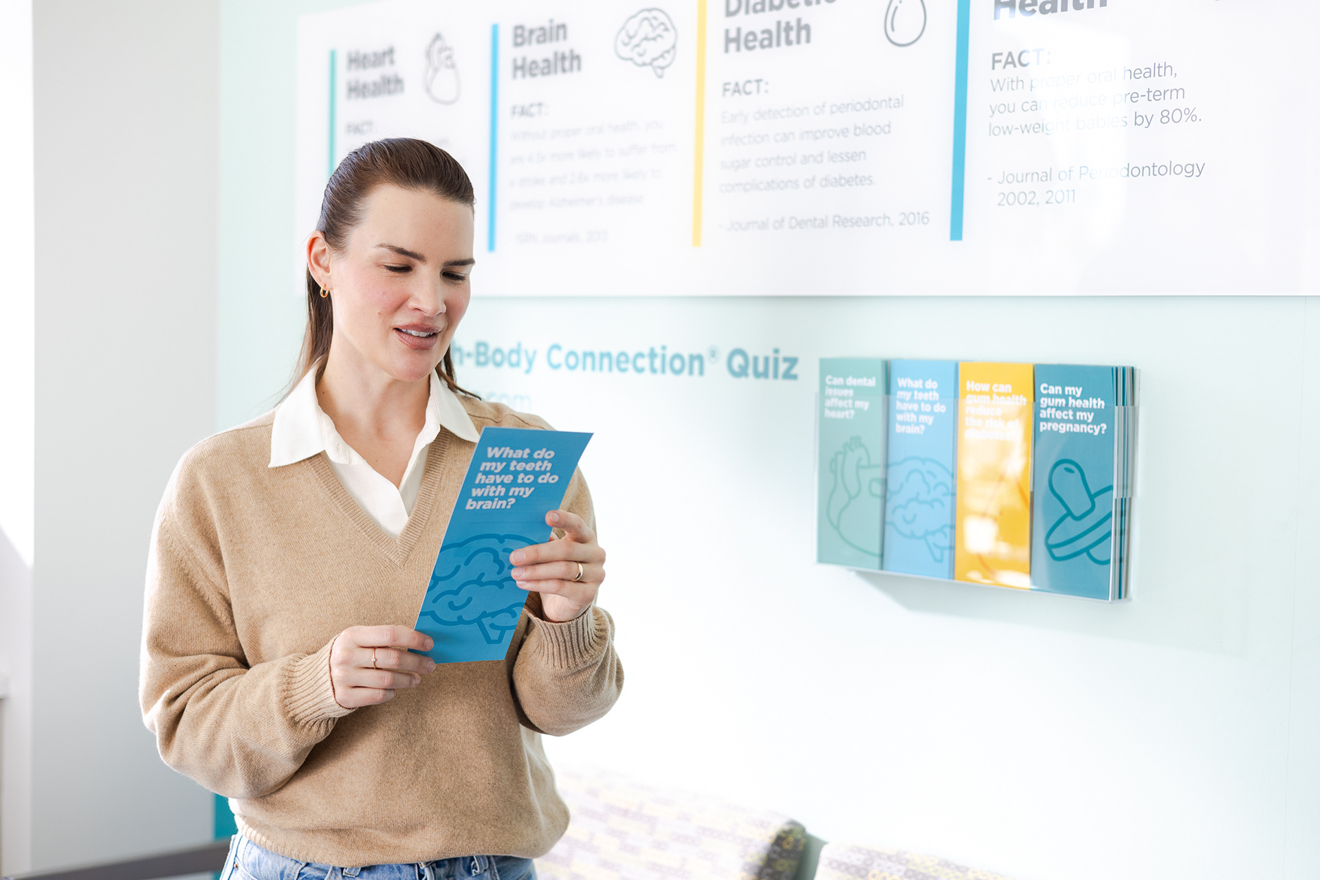
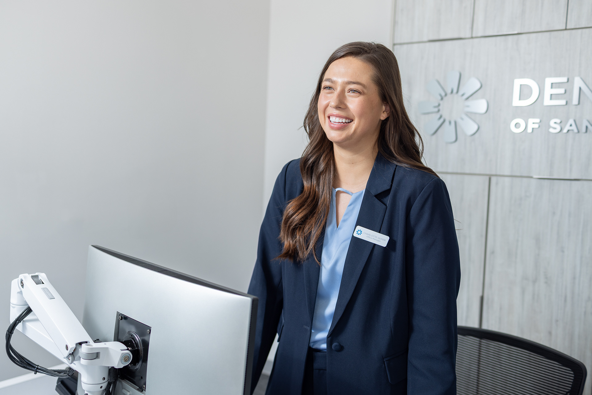
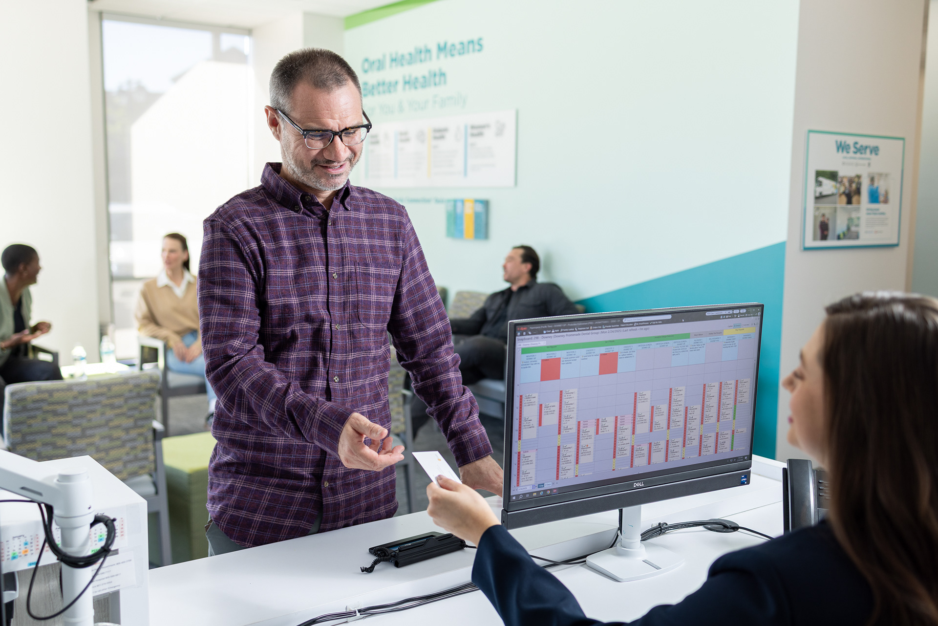
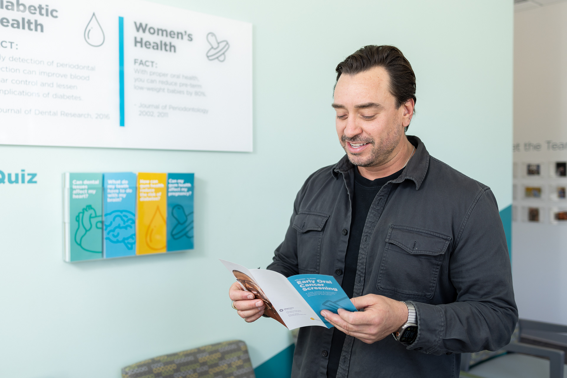
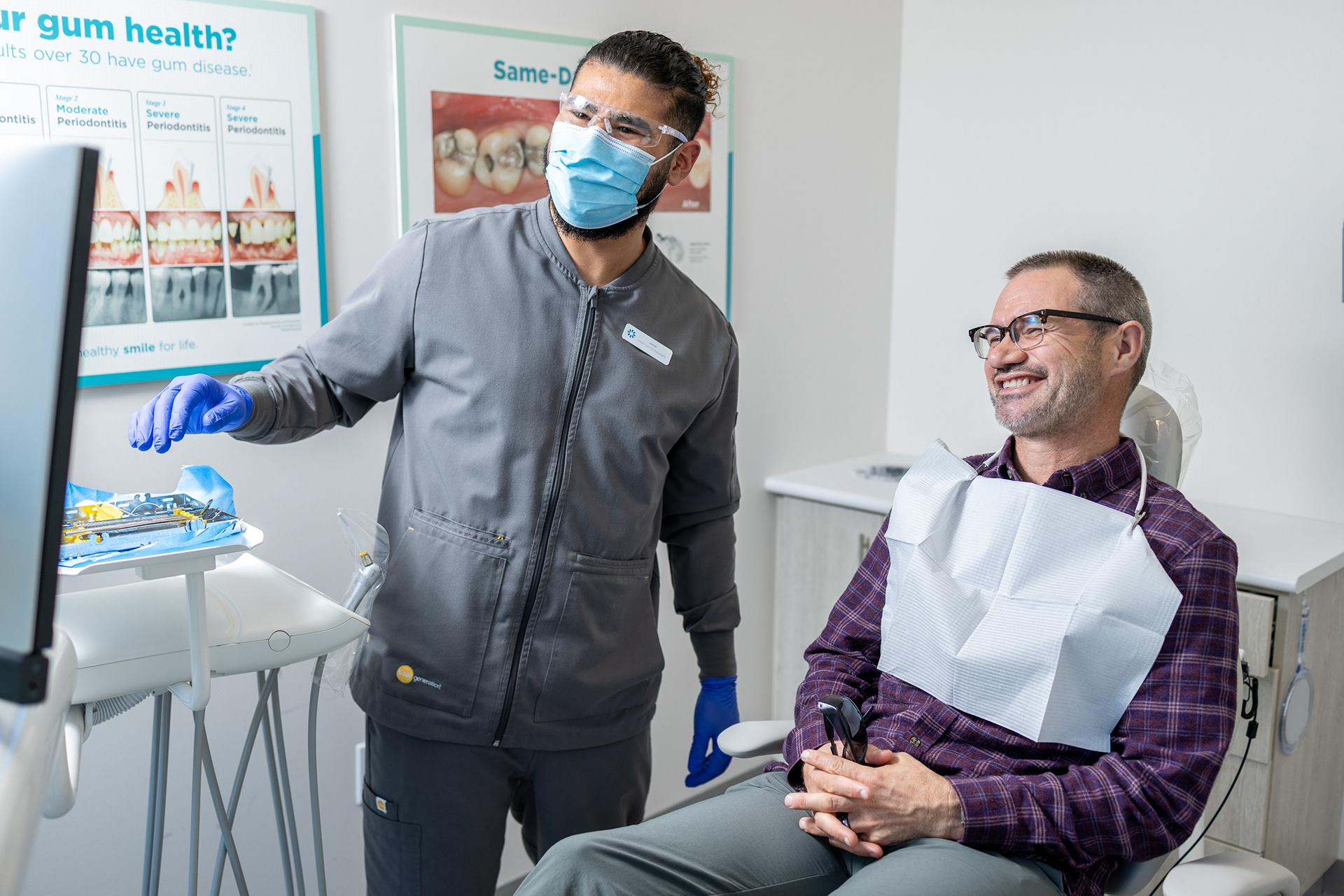
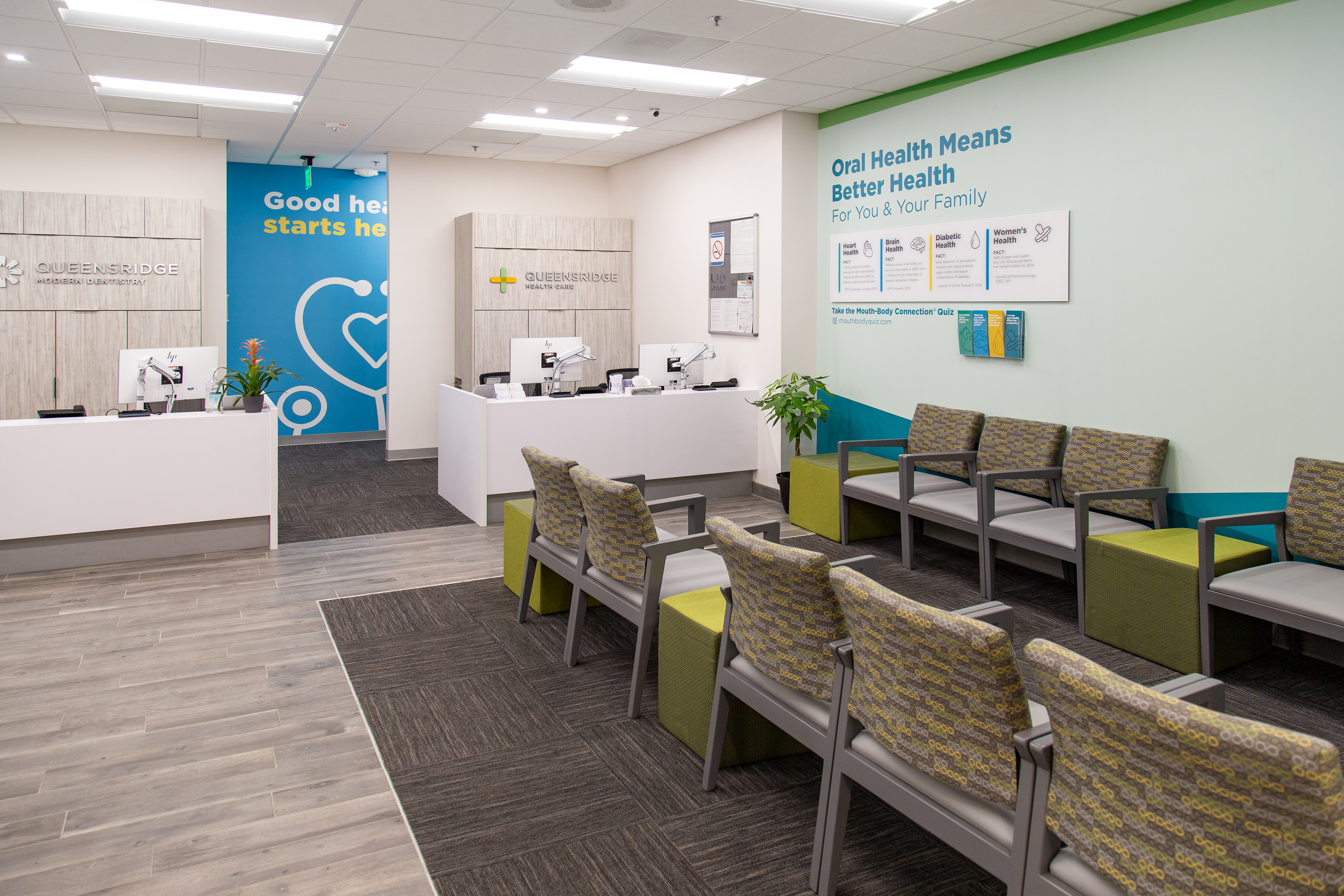
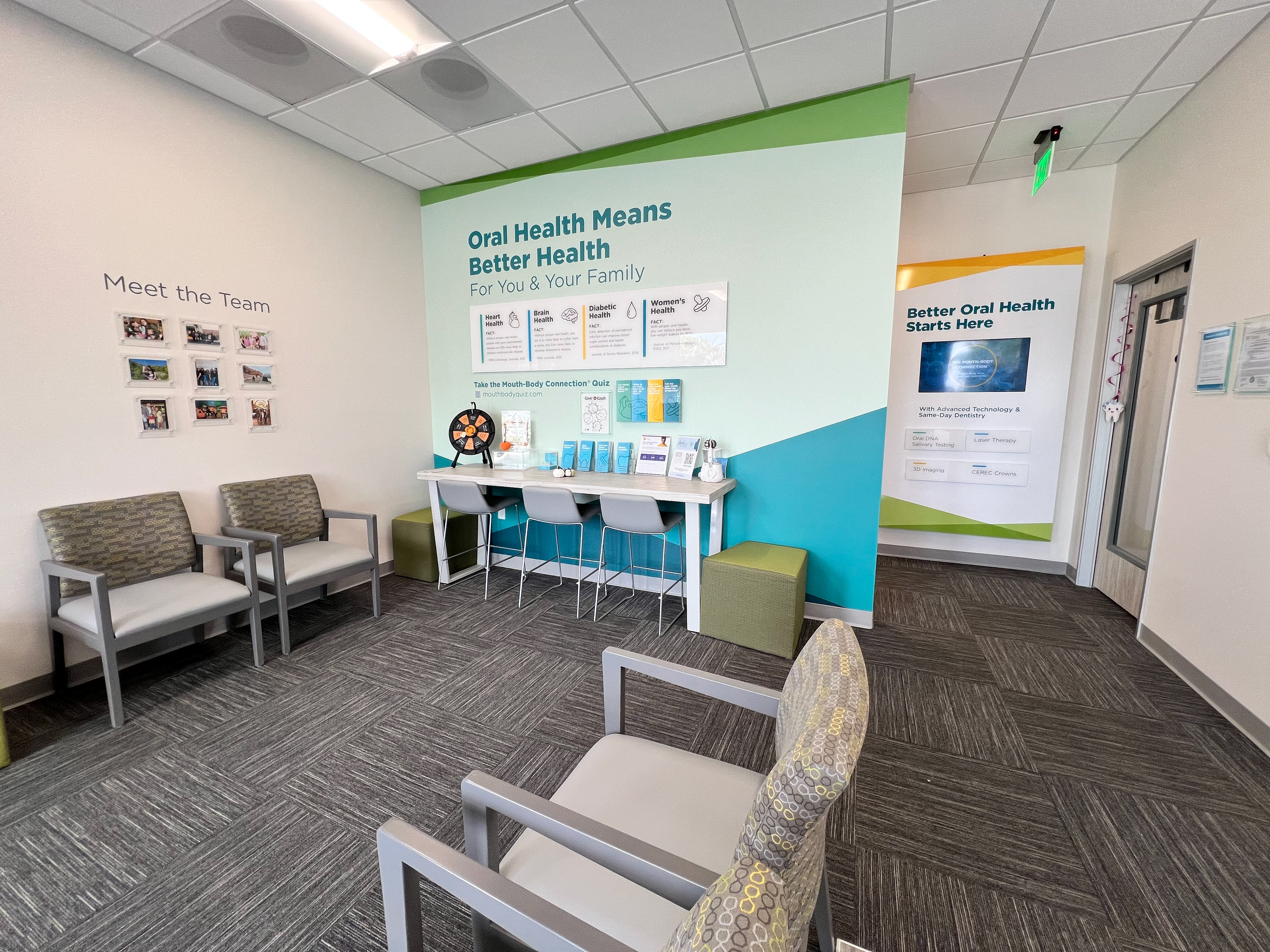
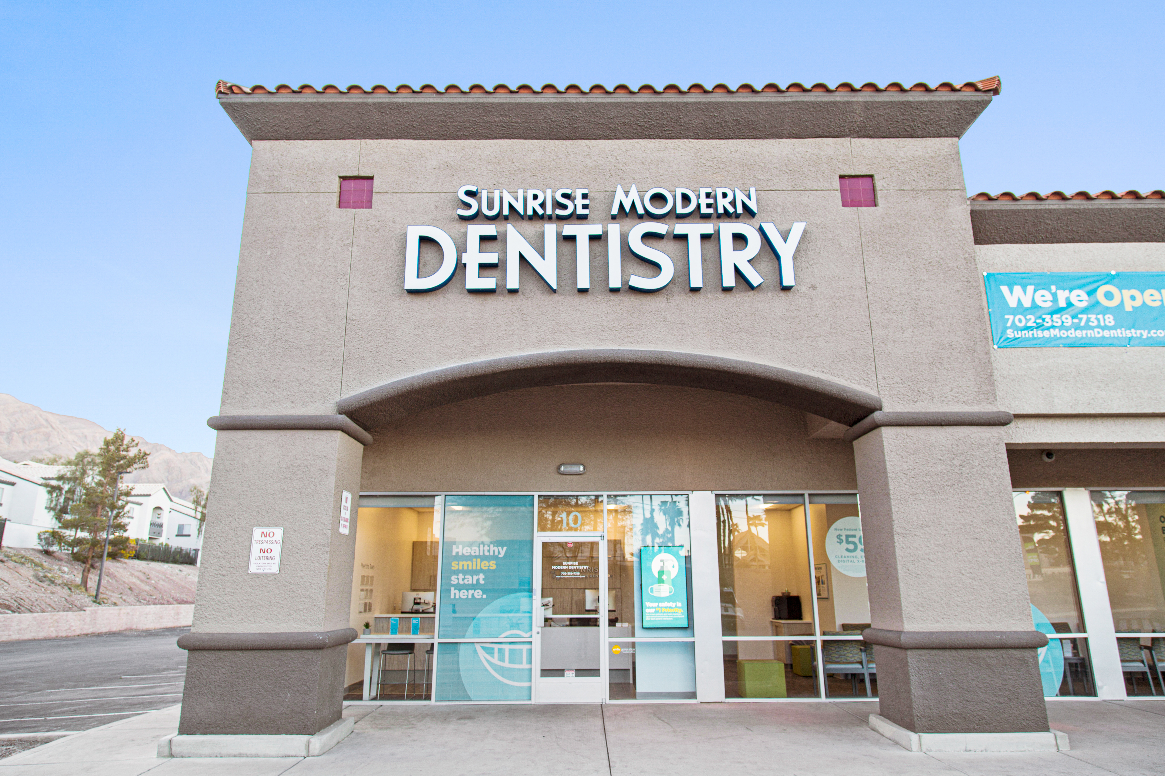
The Dental Office of the Future project explored how brand experience, environmental design, and integrated healthcare could come together to shape a more modern patient experience. My role focused on helping develop visual storytelling and conceptual design frameworks that communicated a forward-looking vision for next-generation dental and medical environments. This included presentation design, environmental graphics, visual systems, and experience concepts that connected technology, patient comfort, and healthcare innovation into a more cohesive narrative. The project aimed to move beyond the traditional perception of a dental office by creating a more connected, welcoming, and human-centered vision of care that aligned with PDS Health’s broader integrated healthcare strategy.

Accomplishments:
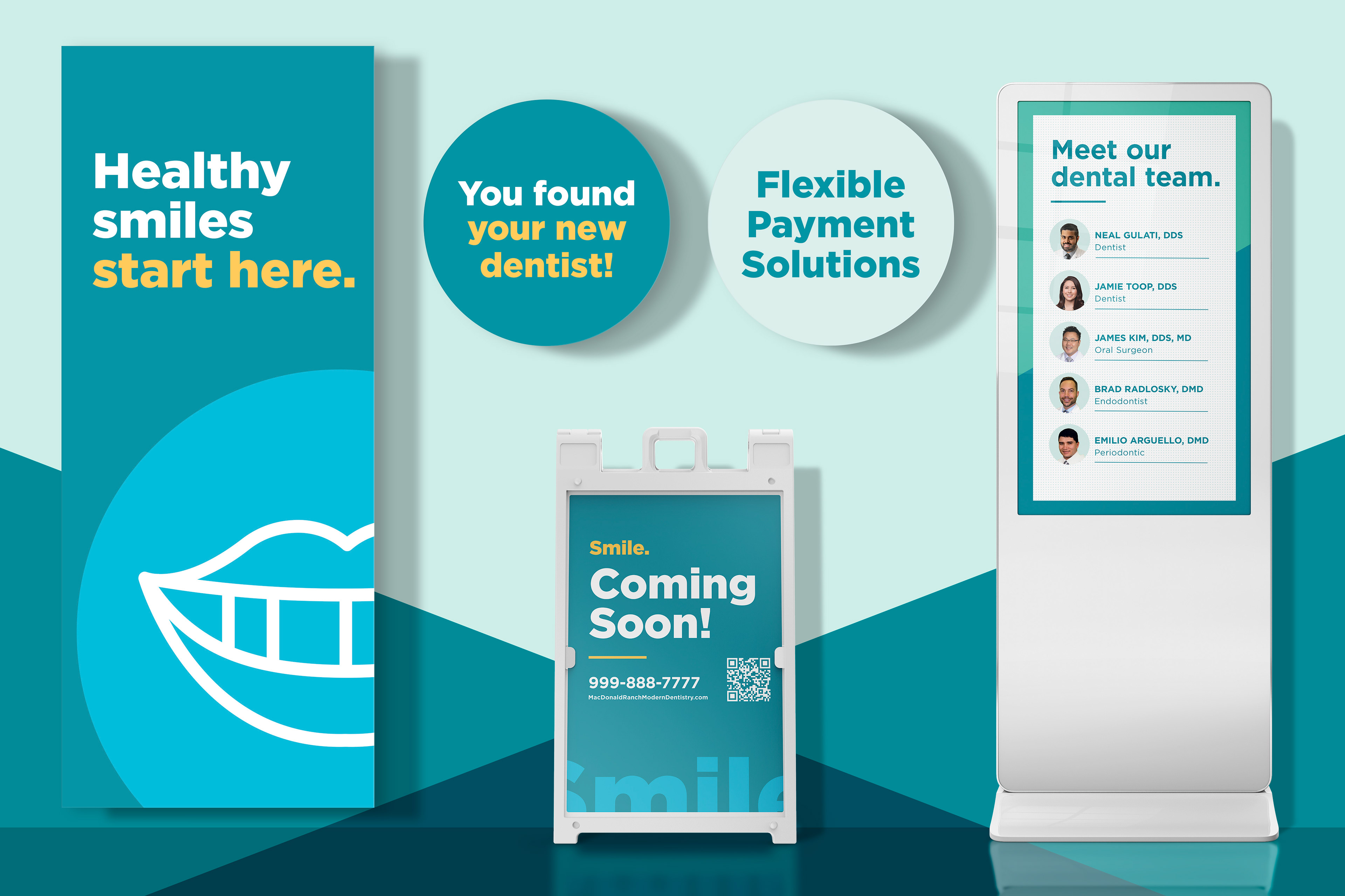
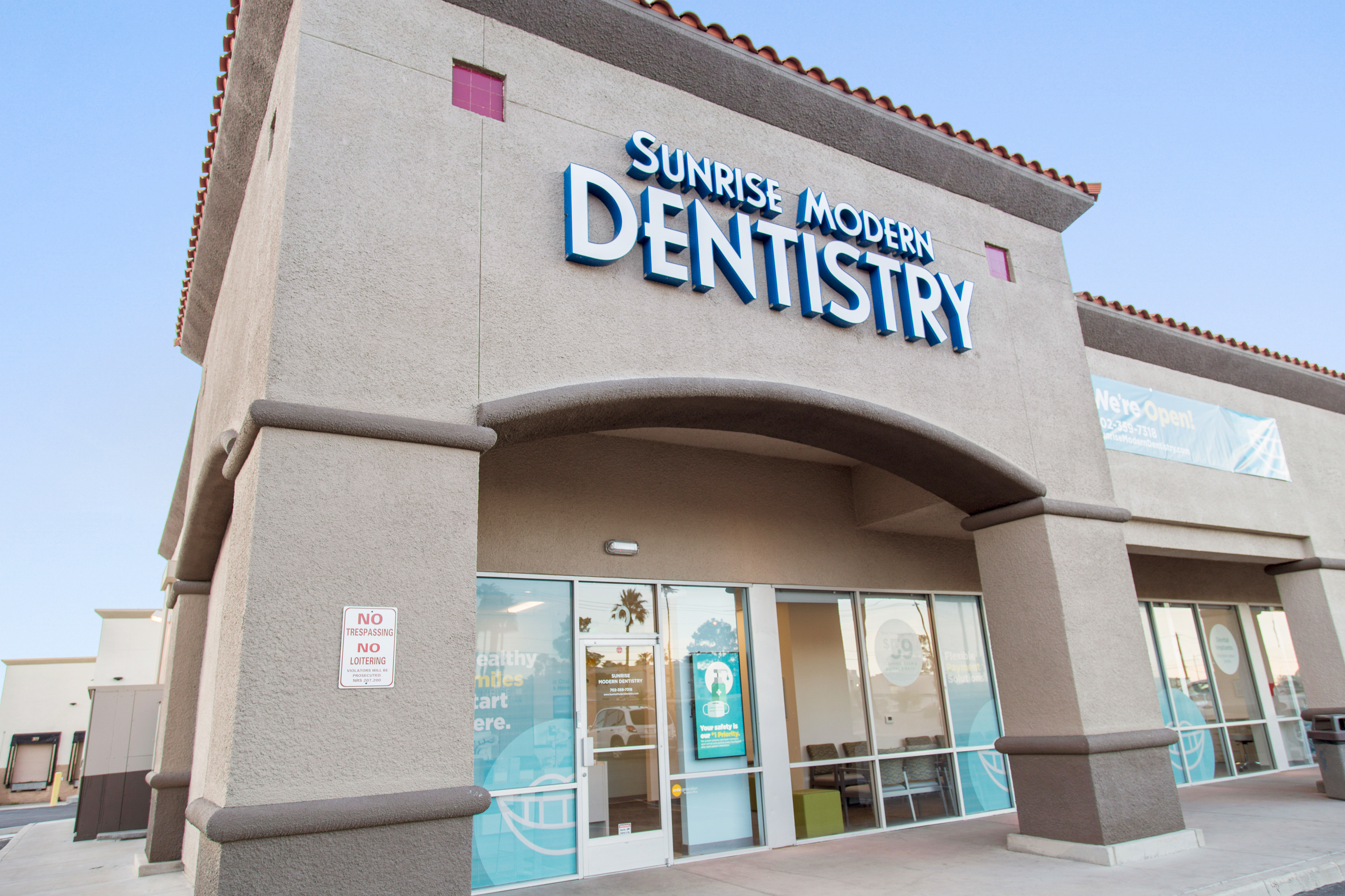
The result was more than just a refreshed look—it was a scalable, human-centered system that redefined how patients experience care. Rolled out across more than 800 dental offices nationwide, the new identity brought consistency, clarity, and emotional resonance to every touchpoint. By aligning visual design with strategic research, we created an in-office experience that supported clinical conversations, deepened trust, and reinforced the organization’s long-term vision of connected, whole-body health. It’s a project I’m proud of—not just for its scale, but for the way it bridged insight, execution, and impact.